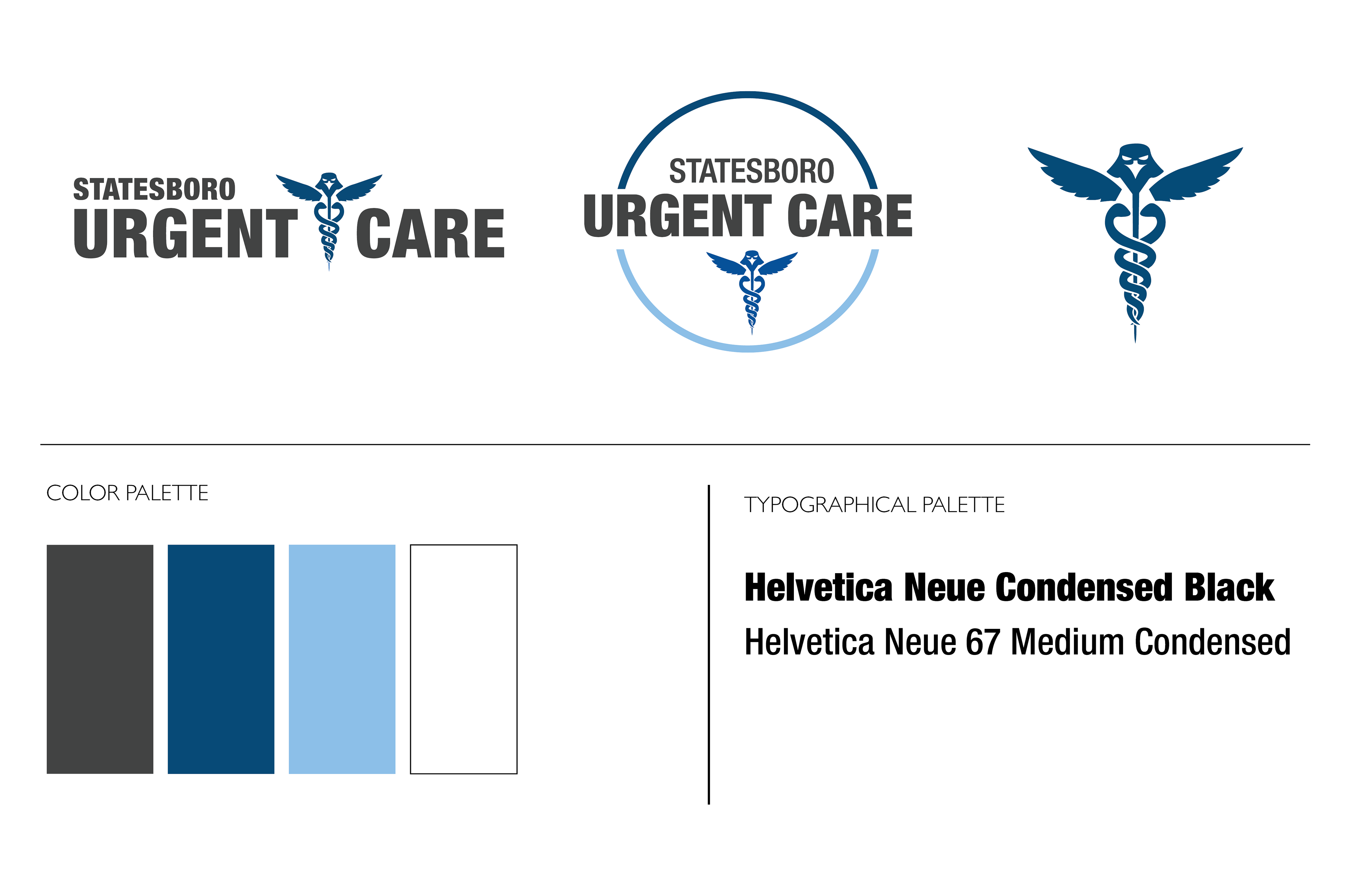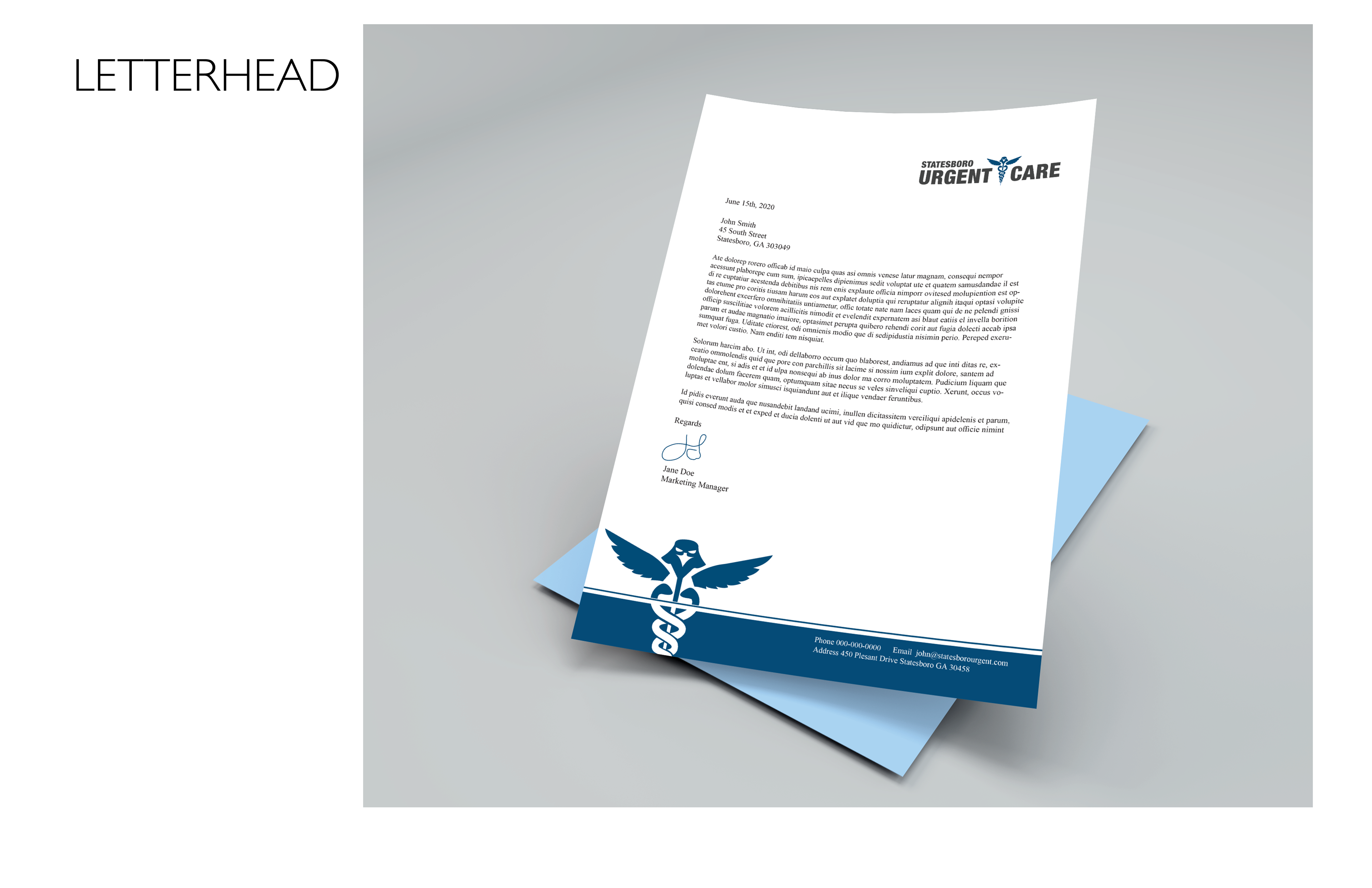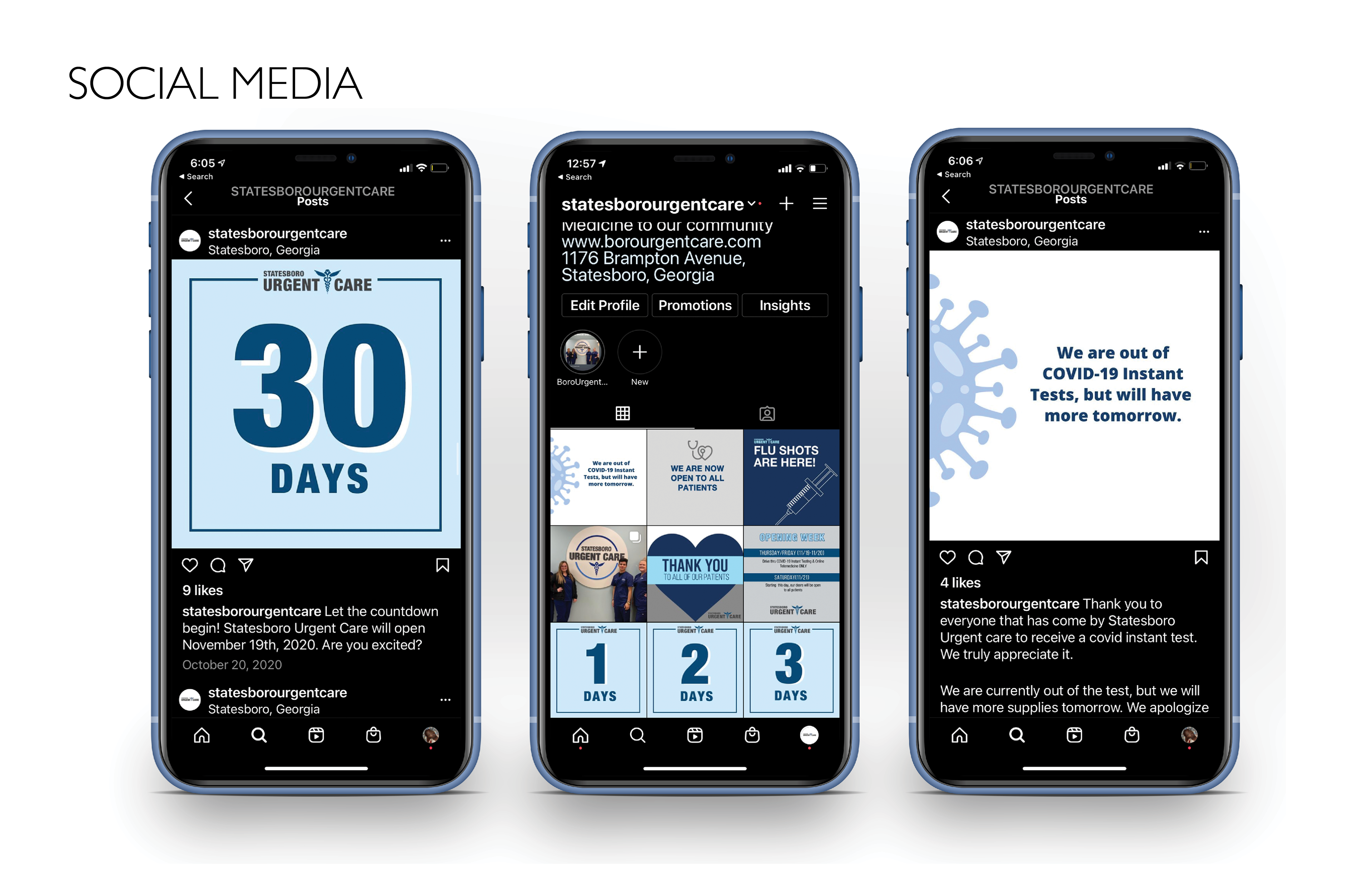
I was an intern for the Business Innovation Group in Statesboro, GA Summer 2020. The main project I worked on while working there was a brand identity for the new Statesboro Urgent Care. I was later hired by them and became their marketing manager. The client only requested that the color blue be used and that the logo should include a caduceus. and maybe incorporate an eagle. I went through multiple rounds of revisions, but the logos the client liked the best featured an eagle caduceus mixture symbol. The logos are also interchangeable. Even though the eagle was a suggestion, I thought it would bring a more personable twist to the identity of the urgent care. Statesboro is a college town where Georgia Southern is located. I was inspired by GSU's eagle symbol, and wanted to create a flat eagle figure for the logo. I also designed a brand manual featuring a style guide of marketing material, letterhead, and all social media content before and after they opened.